Monday, 9 September 2013

BEHIND THE SCENES - COOLEST BRIEF

I am working on the biggest project I have ever tackled by myself, but it is extremely rewarding already and liberating because the brief is anything but conventional. It is fun, wacky and completely out there with complete instructions to make sure things actually do not really match. Complement of course but match? Why would we do that?! It is to be bright, vibrant and completely left of centre. Some of you may not know, sometimes well majority of the times, depending on circumstance and brief the design process takes lots of time and refining as you go by. Refinement is key and completely essential... you should have seen our first meeting... like 10 different books of fabrics and patterns AND ideas.

I am not revealing where and for what this project is for because it will reveal itself in due time but here are some behind the scenes action on the progress. Also, I have featured an amazing chair that was re upholstered for absolutely nothing! It is not for this project but it looks beyond amazing and would be so funky in the right context.


Not for this project but loved the result of the new upholstered seat, which inspired the fabric choice
for the project I am working on. 


Hope you all had a lovely weekend!

Friday, 6 September 2013

FEATURE FRIDAY: RED ON RED

I am very excited to announce today that in today's post I am sharing my first official review, where I received a cool new product that I get to talk about all from my perspective. 

A couple of months ago I wrote about how sleep habits and the importance of getting the right amount for your body. Personally, if I do not sleep well, I feel absolutely horrible, especially if it is over a couple of weeks. We almost spend about 25 years of our lives sleeping, which is massive.

 So, if we require it so much, then why does it often feel like such a hassle when we have to make our beds everyday, change our sheets and make your bedroom and bed look good. Well, I guess like anything, we should all take pride in the our interiors as we do our appearance, which means taking pride and thinking about how to do things to improve your quality of sleep and bedroom, to make yourself feel better and healthier.

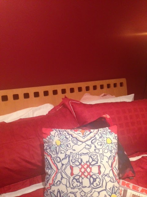
I am always looking for new and cool products that allow for good style but are also functional at the same time. I had never heard of EcoSleep before, but the name definitely had me intrigued and so did their red linen. Now it is a bit of an interior and style fail on my part because my room is painted red... yes, it really needs an update, but it has been my favourite colour since 2004, so having red linen at the same time means RED OVERLOAD... but bear with me. Also, I know what you are thinking... yes, I know the year I decided it was my favourite colour because it was about the time I began to really develop my own sense of self and I decided that red was the colour for me because it was very vibrant and passionate. Two things many of you know are part of my personality so you can only imagine my delight when Jane from EcoSleep shares the same love of Red and wanted to send me the bed linen she has invented called COSHEE. Now, here is my review, full of the good, bad and the ugly... which I have to say, there is not much bad at all and really no ugly...except for me putting red on red.

Image sourced from the EcoSleep Website. Looking very smart indeed and against another red wall.
Red must be a very popular colour. 
I have to say, having your sheets arrive in a little ego friendly bag is a breath of fresh air and really clever, because it means that you can reuse it for storage when you want to change your sheets. If you are like me, I really hate folding sheets and then feel it is so messy in the cupboard when you put them away. So having packaging that you can reuse is a huge bonus and a really clever idea. I have been so sleep deprived over the last week that I have been counting the hours every afternoon to when I can hit the pillow, so on Tuesday when I finally got the chance to try out my new linen, I could not wait, especially because I knew I did not have to wash it first....double bonus!! I was not sure why I did not have to wash it first, but I was told you did not need to, so I followed instruction and felt like a little bit of a rebel because it followed with a strange facial expression from my mother... "you are not going to wash new sheets? " I also loved that there was not too many components to the linen as I soon discovered the top sheet came with the cover. Very clever and efficient way of combining the two, except I was looking to see if there was a matching fitted sheet to complete the look with.

I am one that likes to sleep with just a duvet cover, except for some reason, my bed never stays warm all night, which always wakes me up, so I was very keen to give it a go without any other sheets and just the duvet with the top sheet attached just for the sake of it. The first couple of nights was bliss, the top sheet and pillow cases are so comfortable and soft, but then on Thursday night I began to feel the cold a little and did have to grab an extra blanket, but at least I did not have to worry about taking off the top sheet at the same time.

Here is the product right down from unpacking it. 


Yes I did not have time to iron it before using it either, but if you ask me it still looks pretty good!
And yes i know, there is a lot of RED!

I really like the texture of the linen, it feels lush, soft and very comfortable against the skin. I also really like that it has some texture to it, which I thought may having been irritating against the face on the pillows, but I did not have any trouble at all. However, I feel that texture on linen is not for everyone, so possibility of having the option of a complete smooth surface may be a good alternative. That way you can mix up your bed linen too if you really wanted to, have your display pillows with texture and plain for the pillows you lay your head against.

Like I said, I did not know much about EcoSleep at all and what Coshee is all about, but after my experience I wanted to know much more. The linen is produced from natural cotton and natural bamboo giving it the amazing soft texture and it is a high thread count. This means it does not require any use of harsh chemicals during production, hence the not needing to wash it before use. It is entirely developed with the concept of functionality as well as style, less is more on a bed and not having 5 sheets to wash all at once and strip when making your bed. Which for me and many others a positive as it also means you save on washing time and water because the top sheet is attached to the duvet cover and can be removed if need be.
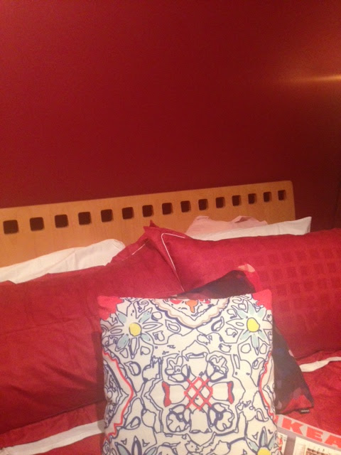
One thing is for sure, my cushions look amazing against my new Coshee linen. 

The top sheet and the duvet cover are connected, which makes for a very smart design. It is detachable if you want
to remove it and keep it separate, but I have no idea why you would to do that. 
Now one of the things I want to point out is that I did not know much about Coshee at all before using it and or reading anything about it further. The EcoSleep website is full of great information about it's use and production however I feel that once I knew more about it, it did not sway my already made up mind that Coshee is a hot well designed and user friendly product. I would highly recommend it to anyone who is looking for smart bedding and wanting to make their bed look smart... and by the way... I am not just saying that because I have to.

Find out a lot more about Jane herself and the EcoSleep team by visiting their website and while you are at it invest in Coshee and see for yourself how great it is.

A very special to Jane for making this review possible and giving me the opportunity to share my thoughts on your product. I hope you love it as much as I loved sleeping in your Coshee product

TGIF!!

JDZ x


Thursday, 5 September 2013

TOP FAVOURITE PICKS

Freedom just recently launched their new Summer collection for 2013/2014, which is super exciting because it is full of fun, bright, vibrant, neon, citrus bits and pieces. I feel it is really playing on the feeling and look that is summer and all the typical things associated with that wonderful feeling that summer brings everyone. Long days at the beach, cocktails, sitting outdoors, entertaining, sand, ocean and sun. These crisp colour combos are a breath of fresh air and for your summer interior; water painted cushions, contrasting colours prints, pineapples and bright furniture is the way to go.

Here are my top picks from the new range which I think are going to be an absolute hit for this summer. One of my girlfriends is moving into her new place in a couple of weeks and we were just talking about how amazing the pineapples are and how it is on her "must have" list. It also looks like YELLOW and mustard are sticking around for another season and making for bight and happy interiors.


All images sourced from Freedom Australia Website and can be found by looking through their website and online store.


Happy viewing,

JDZ x

EMERALD CITY

I have been a little missing in action I know, it has been a bit of a crazy couple of days at JDZ HQ, but nothing we cannot handle and no rest for the weak! You all know how I love to spin my own opinion on trends and fads that are coming in and out of the design world, interiors or not, but this one topic I have actually steered clear of on purpose. Why? Because it has been a super hot topic for majority of this year, so why be the 30,000th person to talk about it when it is a hot topic then be the 1 person who talks about when it needs a little attention again. Pantone every year announce and predict what the hot colour is for the year. It was predicted that the hot colour for the year 2013 was EMERALD! It is funny when you do not often think about a topic, object or colour in a particular way until someone makes it very popular. I have not ever really used emerald or green as a colour for any projects and not because I did not think of it but because I have not had the right brief and I usually associate it with outdoor environments rather than interiors.

Well, with this pantone prediction, also came the introduction of the colour into fashion, wallpaper and homewares, which you may have seen around here and there. I did not know this but in some European countries Emerald or Green is to be considered the colour of luck and good fortune. To me it is also a power colour, not green per say but a rich Emerald definitely exudes power. It is also bright, warming and cool, I think all at the same time. How hard is it to get a colour that can be all three? So hard! And I think that hues of it used in different objects gives it the ability to be all those three things at once. I also love it for a good pop of colour for an outfit, accessory or dress and you will see it appearing a lot more this spring and summer through wallpapers and accessories as the theme and trend begins to lean more toward tropics and citrus.

Here are some images from my Pinterest to inspire a little Emerald into your world. Would you be as brave to use it in an interior? Do you like Emerald? Do you not? I'd love to hear from you and what you think.


I promise to post again today to make up for missing yesterday.

JDZ x

Tuesday, 3 September 2013

THE ENCHANTED FLORENCE


To celebrate the beginning of Spring and the 28th annual flower show, David Jones Elizabeth St Sydney is turning it's down stairs windows into a wonderland of texture, textiles, colour and glamour to celebrate Florence Broadhurst. Florence Broadhurst was a fantastic designer who started her very successful wallpaper business in the 1950s amongst a lot of other things, that produced beautiful screen printed designs. She revived the trend and gave it the glamour and style that wallpaper required during that time period and became very much renowned for her beautiful and elegant signature prints.

Signature Prints is the name of the company which has successfully maintain Florence Broadhurst's legacy and continues to produce her unique designs, which are ever so popular they have even expanded into linen, fabrics and homewares. It is going to be a very unique and exciting event held by David Jones over the next two weeks ( Starting on September 5th ) to honour their working and design relationship with Florence, as well as showcasing her amazing design skills to bring their window display's to life.

If you are in Sydney during this time, you should head down to the Elizabeth St store and just admire the beauty that is her designs, some are so simple but yet so effective and timeless. 'The Enchanted Florence' display is going to be something everyone should see as I really love little events such as this because it really enriches and also makes many people aware of a beautiful product that they can actually utilise in their homes. Florence's designs are so culturally significant in the design realm especially for Sydney as she was an Australian woman that achieved so much in a time where woman were not really seen as successful business owners, yet her legacy and prints are so popular even in our 21st Century.

Make sure to head down to Elizabeth St over the next two weeks and check out the display.
Let me know what you think!

Here are some of my favourite from Signature Prints' collection, which you can find here, as well as a great little video on the revival of the prints themselves.


Enchanted Florence is starting on the 5th of September and running for two weeks. 
All images and video sourced from The Signature Prints website. 


Have a great Tuesday, 

JDZ x

Monday, 2 September 2013

BURNT ORANGE

Hope you all have a very exciting and lovely weekend with the first day of Spring!! It was an exciting weekend for me as it was my birthday yesterday, which is my favourite day of the year and not just because it is my birthday but because it is the end of Winter and we can all begin the rest of the year on a fresh note!

Burnt orange is classified a colour in my books and usually it is a colour that is more associated with warmth as it is a rich tone of orange. Orange, bright or rich can be a fantastic colour to add brightness or warmth/contrast to a space that requires some lifting. This obviously also depends on your current furniture, because orange wont go with everything, but with dark woods, oak and beiges, it can really be a good base for some cushions or rugs that can bring your entire room together to make it feel elegant and warm. It does not need to be over powering, but a pop of the colour, contrasted with a beautiful latte, beige and mustard yellow or even bright yellow can really do the trick! Don't believe me, find yourself a colour wheel and put all those tones together and you will have a winning colour palette. Speaking of palettes, I love a good orange, as in the fruit and I also love a good cafe with great food and it gets even better when it has an amazing unique retail store to go with it! Where can you find such a place? Well look no further than Burnt Orange in Mosman, Sydney.

I was fortunate enough to have my lovely birthday lunch ( successfully organised by Evan! Woohoo ) at this amazing cafe with a great view, good food, good company and a great shopping experience. What more could a girl ask for?

If you have never been, I highly recommend that you make the journey to Burnt Orange and experience it just for the view, or even just for the shopping. If you are into really unique, cute and different bits and pieces for your home, this boutique store is the place to go! Moroccan door knobs, colourful throws, cute shift dresses, Megan Morton's book, lamp shades, floral plates, the works! Sit down upstairs and enjoy your purchases with a great coffee and some delicious chocolate pie, I assure you, it will make for a great afternoon. So, not only does the colour make for a great palette, bright or warm but it makes for a great name of a fabulous Sydney local cafe and retail experience.

You can find out more about Burnt Orange by clicking here and the online shop by clicking here.

Here is a little behind the scenes of my very own birthday lunch with my lovely friends.


Retail images sourced from the Burnt Orange website and the rest were taken by JDZ herself.

Have a great afternoon,

JDZ x

Friday, 30 August 2013

FEATURE FRIDAY: BREEDS OF MEN


Continuing the count down to Spring means that we are also heading into Father's Day this weekend. 
It is always nice to have a day dedicated to your dad and mother to let them know how grateful you are for everything that they may do for you and to honor them for being parents. I am not a parent myself, but I guess one day I will be and it will be those special days that make all the harder ones and challenging days worth it. There is the argument that appreciation and love should not be shown just on one particular day but everyday, which I whole heartily agree with, but I guess it is more of a consistent way of the whole nation to ban together and dedicate it to either your dad or your role models. I find it really difficult buying anything for my dad because he really is not your typical Mr. Sporty, Mr. Action, Mr. Adventure kinda guy, he is more the Mr.Cooking, Mr. Arty, Mr. Music, Mr. Eclectic kinda guy which means things like footy tickets, beers, bbq's and an adventure activity is not going to cut it. This year I am finding it particularly difficult to buy my dad something special that he does not already have and does not already love. He just really does not fit the mould and not in a bad way, as everyone has their own personalities and loves, which I would never change in my own Dad because if I did, I properly would not be the creative person I am today. 

I wanted to introduce you to a great website that I think is really breaking the mould in terms of buying products and or gifts for men with their take on "breeds" of men and having a lots of catagories and products that cater to not just one type of guy or Dad in this case. The online shopping stop for men is Navy Crockett. I absolutely love it because it means I can really pin point the type of guy I am looking to shop for and I can find some really different and cool things I probably would not find in a standard store. Tick! I have found something I think my Dad would like. It is not just great for the Dad's but great for the boyfriends too and here are my top five picks below for a fun, creative, fashion loving, coffee drinking, cooking loving Dad. 

If you are looking for the perfect gift, head over to Navy Crockett's website now


Why not gift a great print for your Dad's own Man Cave?

+
Is your Dad a lover of Coffee? 

Bright cool shoes to jazz up any outfit! 

+
Does your Dad like to cook? Why not get him a Diamond Sharpener?
Does he love music and not know how to use technology well? This could be a great
gift for when they are cooking or enjoying a nice working day in their studio's
 = one happy funky Dad


All images sourced directly from the Navy Crockett website and can be found under all their breeds listings. Hope you all have a lovely weekend and enjoy your first day of SPRING!

Looking forward to ringing in the new season with you all.

JDZ x


Related Posts Plugin for WordPress, Blogger...